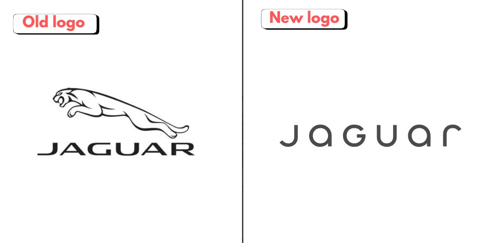
Jaguar, known for its luxury, style, and performance cars, recently went through a massive rebranding. They archived all their promotional material from all social handles. And post their all-new brand identity.
They changed their whole identity from logo to emblem and also their taglines and their brand color palette
A Minimalist New Logo: A Departure from Tradition
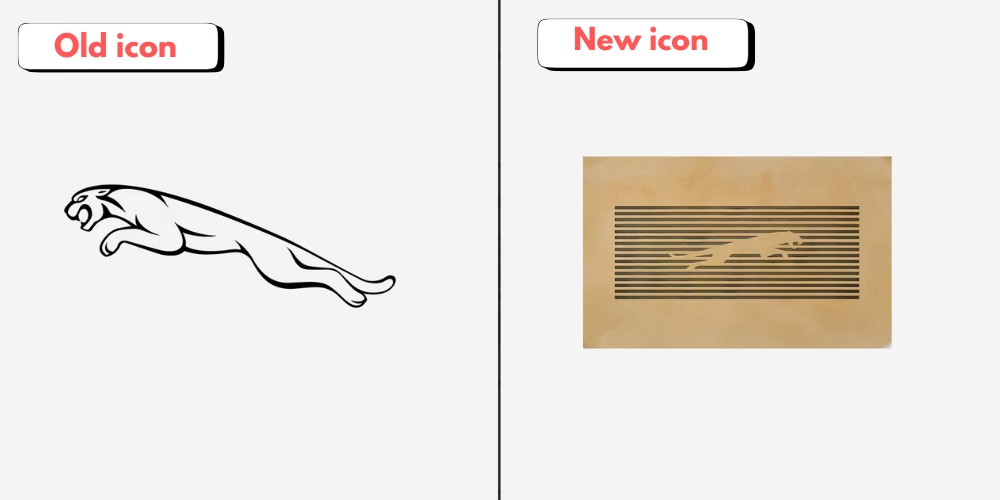
The new Jaguar logo emphasizes simplicity and elegance. Featuring a mix of upper and lower case fonts, it departs from traditional automotive branding by adopting a “less is more” philosophy. This aligns with Jaguar’s vision of exclusivity and sophistication. The leaping jaguar icon, a longstanding symbol of power and grace, has also been refined, embodying boldness while maintaining its recognizable essence.

Design Insight
The minimalist design reflects modern luxury trends seen in brands like Bentley or Tesla, catering to a high-end audience with understated sophistication.

Introducing the ‘Artist’s Mark’
Another key element is the introduction of the “Artist’s Mark” — a circular logo symbolizing Jaguar’s commitment to originality. This design choice aligns with the brand’s ethos of creativity and unexpected thinking, echoing the vision of its founder, Sir William Lyons.

What Designers Can Learn
Creating a timeless brand identity requires blending nostalgia with innovation. Jaguar’s reimagined aesthetic captures this balance, making it relevant to both loyalists and new, younger audiences.
Visual Language: ‘Exuberant Modernism’
Jaguar’s visual rebranding, guided by the philosophy of “Exuberant Modernism,” prioritizes bold and fearless creativity. This approach extends to its upcoming electric vehicles (EVs), which feature avant-garde designs that defy conventional EV aesthetics.
What This Means for the Industry
Designers should note how Jaguar is differentiating itself in the saturated EV market. Its emphasis on “copy nothing” as a mantra underscores the importance of standing out through unique visual storytelling.
Jaguar came with new taglines defining the brand including-
- Copy nothing
- live vivid
- delete ordinary
The EV-Centric Future
Jaguar’s rebranding coincides with its transition to an all-electric lineup by 2025. This shift elevates the brand into the luxury segment, targeting competitors like Bentley rather than BMW or Audi. The first model under this vision, a £100,000 four-door GT, combines cutting-edge tech with striking design, showcasing what Jaguar calls “fearless originality.”
Sustainability in the Spotlight
Jaguar rebranding is more than an aesthetic upgrade—it’s a declaration of environmental responsibility. By 2039, the company aims to achieve carbon neutrality across its supply chain and operations. Designers played a crucial role in integrating this commitment into the visual language of the brand, ensuring that sustainability feels like a core part of Jaguar’s identity, not an afterthought
Why This Matters for the Design Industry
- Jaguar’s rebranding highlights the growing role of graphic design in corporate transformation. It demonstrates how visuals can tell a story of progress, sustainability, and luxury. For designers, this case study emphasizes the importance of:
- Balancing tradition with modernity.
- Designing for a digital-first audience.
- Leveraging visuals to communicate a brand’s core values effectively
Conclusion
Jaguar’s rebranding is a masterclass in redefining legacy brands for a modern audience. It’s a reminder that innovation isn’t just about following trends—it’s about creating them. As designers, we can draw inspiration from how Jaguar merges storytelling, bold visuals, and technological innovation to carve out a unique identity in a competitive market.
